
There are thousands of fonts – and thousands of people who like to explore their subtle differences and have a strong opinion on the subject. If you’re one of these people, you’re in luck because the art of typography has a bright future ahead of it: many Pinterest websites and groups are dedicated to font enthusiasts.
For all the others, you may simply be wondering how to choose beautiful, readable fonts for your website? In this article we have gathered all the information you need about fonts.
The different types of fonts and when to use them
There are many ways to categorize fonts. But for the purpose of creating a website, it’s enough if you know these three categories: serif, sans-serif, and decorative fonts.
The term serif means “serif”: it is the small extension that forms the end of the characters in some fonts. So there are serif fonts and sans serif fonts.
Serif fonts
Wheelbases are common in the newspaper industry because they are easier to read, especially if you are dealing with very small writing blocks. You will find serif fonts in magazines, books, newspapers, etc.
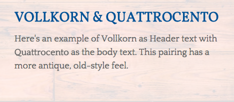
Some classic serif fonts: Vollkorn, Merriweather, EB Garamond, and Libre Baskerville.
Sans serif fonts
When people started reading ahead on computer screens, sans serif fonts were created. Embellishments were abandoned to make way for more modern and simple fonts – fonts that display more distinctly.
Some known sans serif fonts: Open Sans, Roboto, Lato, and Ubuntu.
Decorative fonts
And then there are the decorative or “fancy” fonts. This is a very broad category, including more artistic fonts. These fonts have more personality but should be used sparingly.
Many decorative fonts have been created for their graphic appeal and not to be easily read in paragraph form. They are therefore perfect for headings and short sentences but not for the body of the text. In other words, if you insert an entire paragraph in cursive writing on your site, your visitors will probably have trouble reading it all the way through.
Where to use different Google fonts on your website
We generally recommend selecting only two or three fonts for your site:
- One for the body of the text/paragraphs: You can’t go wrong with a readable sans serif font for your text elements, especially if the font size is small. Avoid cursive writing or all-capitalized fonts, which are difficult to read if the text is a bit long.
- One for your titles: you can use a more decorative font, as you will only use it for short texts. You can also use an all caps font. An original font will allow you to add personality to your site.
One for your navigation and buttons: you can use one of the two fonts already used on your site, or choose a third complementary font. Don’t forget that your navigation and buttons must be very readable. We therefore advise you to avoid cursive or overly stylized writing. As with your titles, you can use an all-capital font. - The important thing is to find the right balance. Think of your fonts as your guest tables at a wedding; one person who sets the mood is usually enough, as too many people with strong personalities can make the atmosphere a bit heavy .
- Want to use fewer fonts? No problem. There’s nothing wrong with using just one font on your entire site: you can differentiate your titles and texts with different sizes and colors.
- Or do you want to use more? That might be a little more complicated. Fonts create consistency and hierarchy on your site. If you use a lot of fonts, it’s like having a lot of traffic signs at an intersection. Your site may then become less efficient.
The psychology of different fonts
People react differently to colors; the same goes for fonts. If a font does not match the message or brand of the site, visitors will find it strange. For example, imagine the website of an accountants’ office that uses the Amatic SC font with a rather casual, handwritten style. It’s not the kind you’d expect from an accounting firm.
Personality
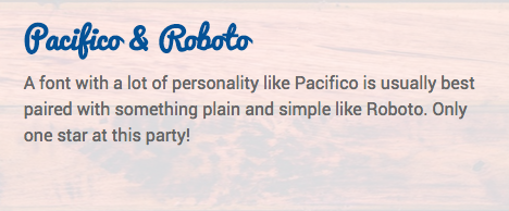
Fonts can be modern, simple, chic, playful; and these font “personalities” should reflect the personality of your brand. If you choose a slightly feminine look for your site, you should select two fonts that also share this personality, even if they are different:
Period
Many fonts have historical references. If you want to evoke a certain era, why not choose two fonts that are a bit retro:
Harmony
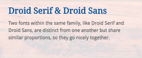
To match two fonts, choose fonts with similar proportions or letter shapes. Fonts belonging to the same family (such as Roboto and Roboto Slab) will have similar characteristics.
Where to find the right Google font combinations
Many websites recommend combinations of fonts so that you don’t have to create them yourself.
- Google Web Fonts Directory: With a filter and good examples, the Google Fonts Directory offers suggestions for popular fonts in a column on the left side.
Fontpair: This site has a good list of font pairs to recommend to you, sorted by category (serif/sanserif, cursive/serif). Even better, you can enter your text on their website and see the rendering directly. - TypeConnection: This is a nice tool to use since it is presented a bit like a font dating site.